Thursday, September 27, 2007

2 page layout


This is my 2 page spread. I like my idea of dividing up th page and using a lot of black. I tried to use the black and white areas as the place your eyes could rest. I added small text at the bottom of each picture to explain what was going on. I wrote in white on the black because i wanted it to look natural and crafted, not printed off a computer. Unfortunately some glue bled through th paper so there are small little smudges. Also I feel that the gold overpowers the entire image. I was hoping the huge black slab would balance it out, but I don't think it does.

Tuesday, September 25, 2007

Welcome to the dark side


This was a really fun piece. I really like the dramatic shadows and that most of my face is in the dark. I like how mysterious it looks. o_O

Thursday, September 20, 2007

Pencil Box

This is the fold out with the pencils from the side.
This corner was made using scoring. I really like this technique because it makes your corners look very clean and precise.
This was one of my many lids. I'm glad I went back and cleaned up the lid and made the cuts thinned and cleaner.


This is my pencil box. I had numerous ideas come to me at first, but I really liked the fold out/accordian idea best. It displays the pencils very well and each pencil as it's own slot. I chose black and white because I thought that made it look very crisp. The only problem is that white gets dirty very easily. My favorite is the black striped paper. I cut rectangles into the top to give it some depth. The hardest part was making those cuts very clean. I designed the box to look boring on the outside so when you open it and get a fold out it's a complete surprise. I like things that are hidden and require attention to find out its secrets.

2 more profiles


Here are two more profiles i did. i feel pretty consistent in my work. I still need to work on getting the likeness of the person in my profiles though.

Tuesday, September 18, 2007

profiles


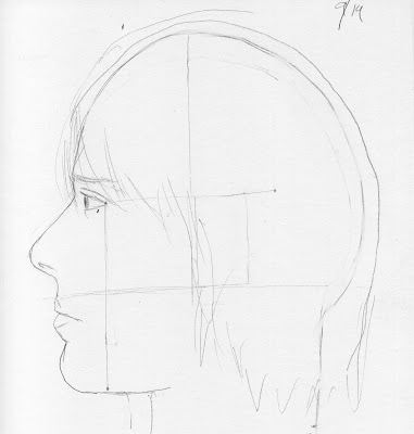
Here are two profiles i did. They turned out well, but not as good as i hoped. I really wanted to use value when drawing these, and it was hard not to. I think the triangle method works and it helps make the face more proportionate.

Monday, September 17, 2007


Here is my egg project. It's very simple and it's supposed to showcase the egg's shape/geometry. There is a triangular cut-out that i've been told looks like a film reel. The triangle is a very over exaggerated form of the egg. The "bottom" bottom of the egg is bigger than the top. The bars that separate the triangle are there for support, although I like how they look. i made a tube shape to show how oval the egg is when put against a circle.

Thursday, September 13, 2007

this is my room mate brushing her teeth. she kept moving a lot so i tried to sketch her fast. i didn't draw her face because it would've been unflattering to say the least.


this one is my favorite, even though it's the simplest one. i like how she is sitting and i thnk i did an ok job of drawing her.......and no face!


i named this one perfect guy because he was pretty still and he was sitting in a perfect position head on. i tried to put a face on him and i'm glad i tried but it didn't turn out how i wanted it.


i did this one at my cubicle. the head turned out lopsided but i think you get a good feel for how the figure was positioned.


here are my four drawings of people. they were done in different places: campus, studio, starbucks, and mt apartment. i didn't draw many faces because i feel like the picasso-ish faces i draw on people when i'm in a hurry to get the figure down take away from my drawings.

Failed attempts


so i drove out to a coffee shop last night and when i got there, there was no one to draw. everyone kept getting up and leaving. it was very frustrating. this is the page in my sketchbook of failed attempts and random doodles while waiting to find someone who would sit still.

Tuesday, September 11, 2007

penciled in downtown


these are my four drawings of downtown. i'm surprised there isn't sweat all over them because...wow...it's really hot. it was hard not to add any value to the drawings.

space bike


this is the negative space drawing of the bike. it looked ok upside down...but right- side up is a different story.

Thursday, September 6, 2007

2nd attempt


Since i was one of the later blog entries i got to see people's second drawings in class and i don't think i did this right, but i like the outcome regardless. I chose a very zoomed in image of my original image and tried to simplify it. I didn't want to do too much detail. I like the huge shapes in this picture.

my first attempt


This picture was drawn in front of the ferguson building. i was drawn to the tower on the building across the street and really just wanted to focus on that. My trees are very un-tree like. They look like huge masses that have nothing to do with nature. I was just trying to get a rough sketch of the trees but i think i went too rough.

negative contours are so pessimistic #3


This was by far the toughest one to do. I think i start off strong and then loose my focus towards the end. My top part of the chair is ok, but then near the bottom i loose my focus and it falls apart.

negative contours are so pessimistic #2


This is a t.v. stand in my living room. I didn't draw the t.v. part though. this image came out pretty unrecognizable and i think that's pretty cool!

negative contours are so pessimistic


This is a negative contour of my boyfriend leaning against the wall. I think i captured the lean pretty well with the negative space so i didn't draw the rest of his body. I think the negative spaces say enough.

my awesome hand


I definitely did not cheat on this one. i like how it turned out though. it looks as though my hand melted....and i like the look.