Tuesday, March 25, 2008

Sunday, March 23, 2008

bottle CAPS


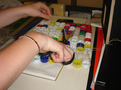
This assignment gave me a new perspective on trash, and that is how many different things you can do with besides throw it away. We started off making a bracelet out of bottle caps and then stamped a design on them. This looked like an incomplete design so we decided to make a floor mat out of them. We sewed the bottle caps together using hemp, which is very good environmentally. The mat is actually quite comfortable to stand on. We were also going to paint the top of the caps white, but then we decided to embrace that it looked like garbage and it has a kind of pop art feel to it. This assignment turned out very well and I'm proud of the outcome.

Go me and Krista!!!!!!!

Tuesday, March 18, 2008

sketch figures


drawing figures is one of my favorite things to do. I really tried to get the gesture of the people, but I don't think I captured movement too well in my drawings.

coffee shop


I'm not the best at drawing still - life or architecture so this was a bit of a challenge to me. I went to a store I used to work at so I was pretty comfortable with the surroundings.

Monday, March 3, 2008

a forked up melon.


This is my project. I really like the design I came up with but I wish i had more time to let it grow a bit more. I really wanted my statement to look organic. I think out boards worked well with each other. They have similar elements but each board is unique. I'm very pleased at how this all turned out.

the board for moore


This is our board for the moore building. We tried to incorporate elements of the building into our board. I think our color scheme worked out very nice. We really tried to not have any awkward spaces on our board. I think the board turned out very sucessfull.

Wednesday, February 20, 2008

scale figures

I like that the images in this picture seem ghost -like, but still accurate at the same time. I also like the use of watercolor and that she put shadows with the figures. I think this image portrays the images well, without taking away from the architecture drawing. You can see more stuff here.
This image looks like the figures were added after the drawing. They are light, yet they demonstrate the scale. I tend to like lighter, less distracting figures. These figures also look like people which is nice. Go here for more.

What i like about these figures is that they show a lot of movement and gesture. The one in the striped shirt looks like it's laughing. I think if you can show movement in your figures it makes your drawing look more appealing. It also makes you want to be in that space because people look like they are having a good time. Link.